Rose Garden
Journaling app inspired by the "rose, bud, thorn" icebreaker. Encouraging users to self-reflect daily with flowers.
Journaling app inspired by the "rose, bud, thorn" icebreaker. Encouraging users to self-reflect daily with flowers.
People struggle to journal consistently because existing apps depend on users knowing exactly what to write. A blank page can feel daunting, making reflection harder to start and sustain.
How can we help users turn daily thoughts
into meaningful reflection?
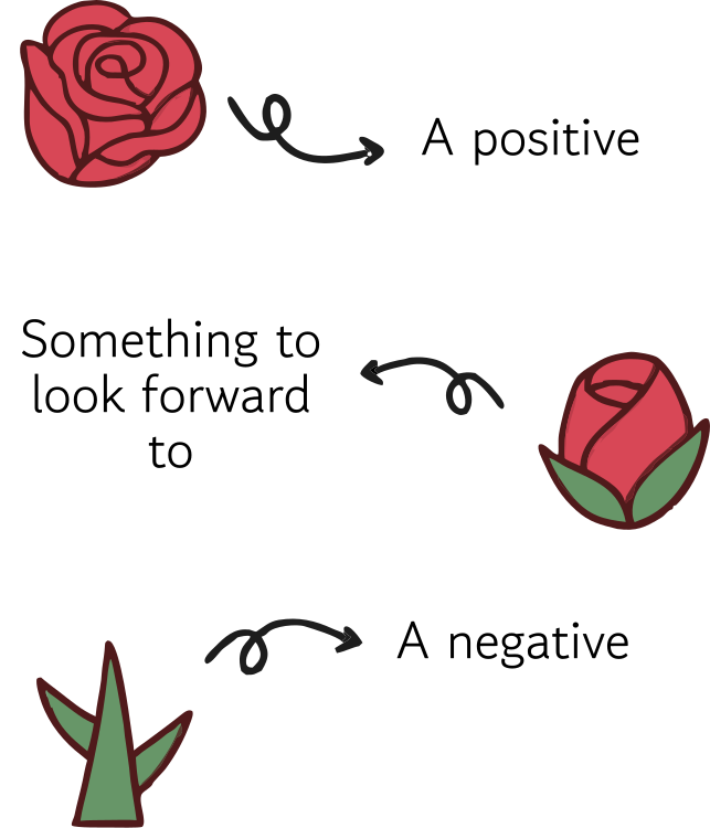
The rose-bud-thorn structure helps users reflect without the pressure of a blank page.
Rose Garden gamifies daily reflection by turning journal entries into flowers users can collect and grow over time.
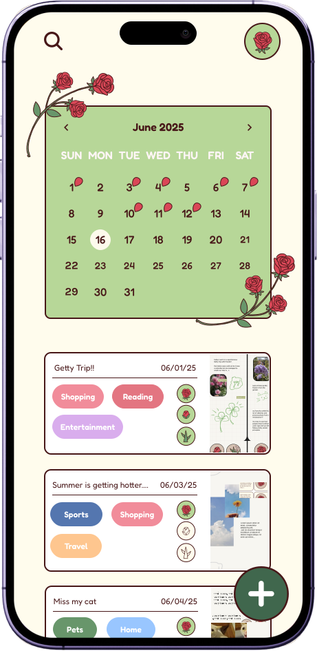
Garden and calendar views help users track their progress over time, making journaling a consistent habit.
We interviewed 30+ students to better understand journaling habits, pain points, and preferences for guided reflection.
"I think prompts would help me organize my thoughts instead of just word vomiting onto a page."
"Prompts feels too restricting for me. I usually have enough to say on my own, but it could be helpful for beginner journalers."
"I prefer paper over digital journaling because I like flipping through pages and seeing my handwriting."
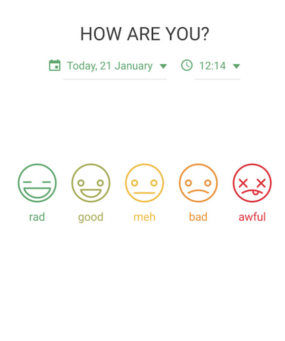
We looked at existing journaling apps to understand how they approach guided reflection and daily habit-building.




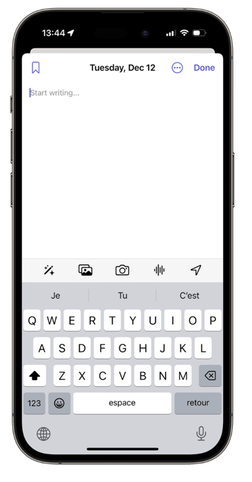
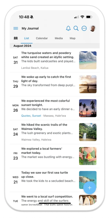
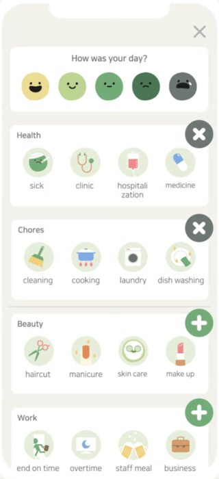
After compiling our findings, we defined main goals for the design:
Use features like image uploads, exports, and customization instead of recreating a traditional journal.
Provide guided rose-bud-thorn prompts that users can follow or skip depending on their preference.
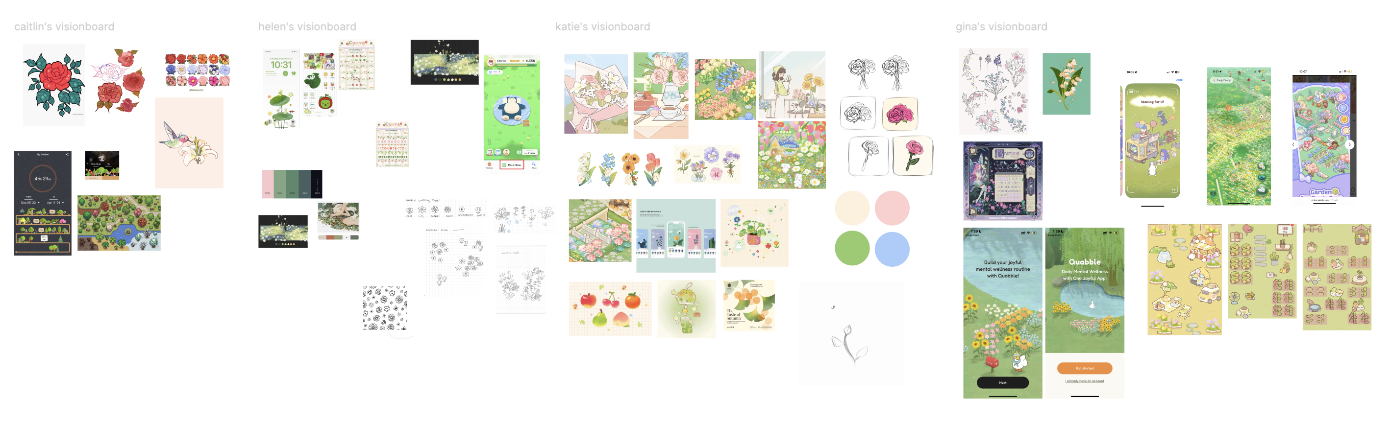
Each designer gathered inspiration for the garden theme, exploring color palettes, illustration styles, and existing garden apps to align on a shared visual direction.
Mapping the app's main areas raised the question of how to combine guided rose–bud–thorn journaling with freeform journaling. Users can opt out of some or all of the prompts, which avoids the stress of answering mandated questions.
01 Journaling Page
I led the design of the journaling page. I wanted to focus on the flexibility of digital spaces, taking inspiration from note-taking apps like Notability and Goodnotes. I implemented movable text boxes, drawing tools, and sticker uploads to ensure journaling was unconstrained by the traditional typing format other apps use.
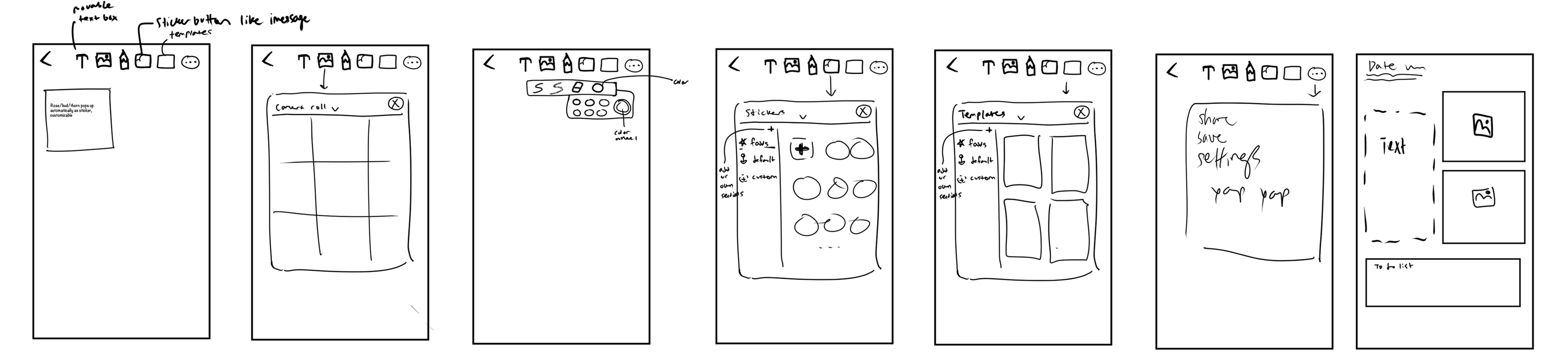
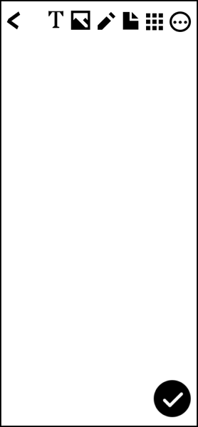
The original iteration was inspired by Instagram Story features, stacking the editing tools across the top of the screen. I ultimately moved them into a sidebar because icons at the top are hard to reach and tap accurately, and the edge clashed with swiping down for notifications and the control panel.
02 Onboarding
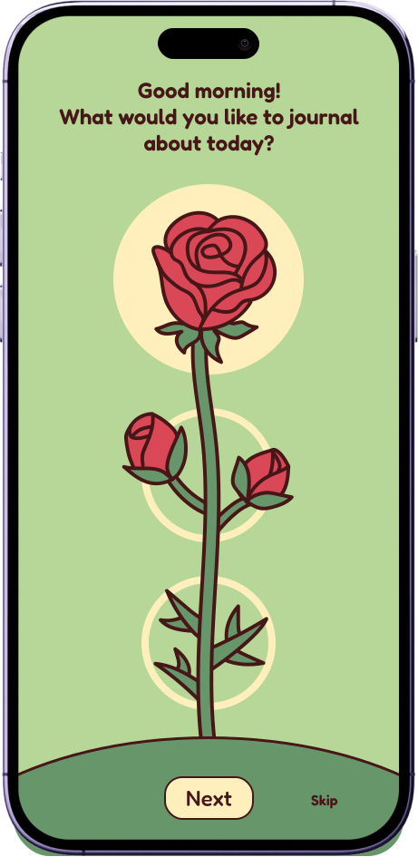
I refined the mid-fi screens into high-fi designs by using green, yellow, and red as the primary colors to maintain visual consistency. I also polished the flower illustrations and used the same rose design throughout the app to create a cohesive experience.


03 Calendar View
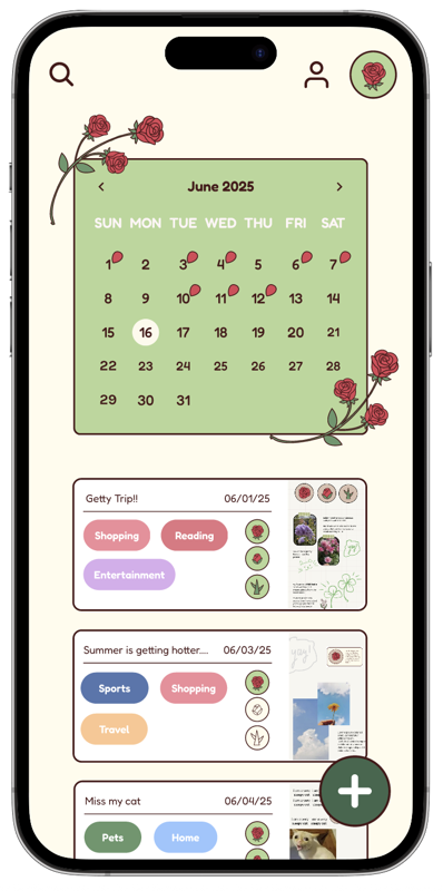
I went through several iterations of the entry preview on the calendar view. It had to stay small enough that users could scroll through weeks of entries at a glance, while still showing enough for the user to recognize and remember what they wrote.
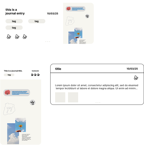
Entry preview preserves personalization
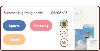
Tags and icons for faster recognition
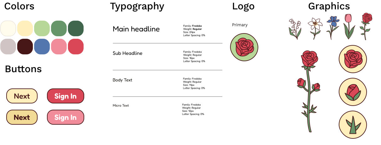
The design system was built around soft pastels to complement the flower illustrations and create a gentle, natural experience. I kept the flower variations simple and focused on color customization, allowing users to personalize flowers in their garden.
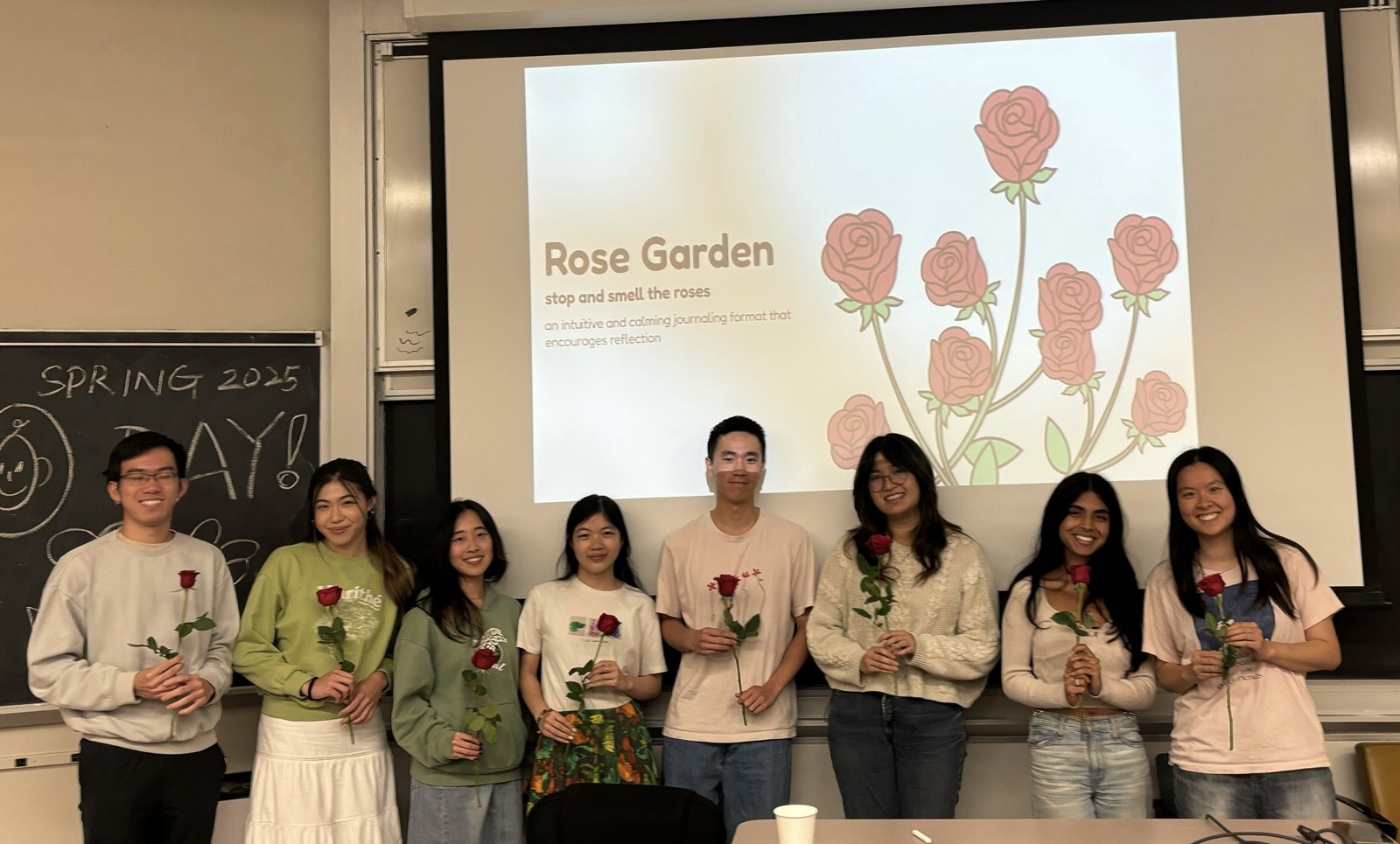
This is the project that started my journey of designing meaningful experiences. It will always hold a special place in my heart!
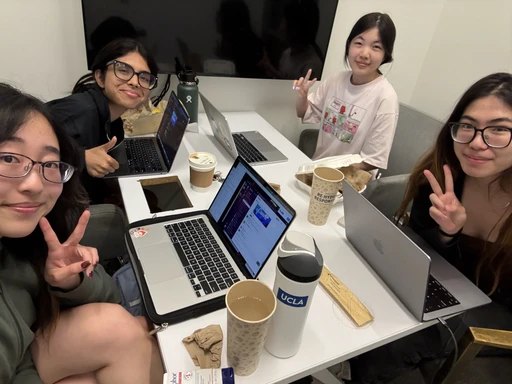
Work sessions were the highlight of my week. We spent hours bouncing ideas off each other, and designing together in Figma showed me how collaboration can make a product stronger.
Our user interviews were challenging because many people did not like the idea of guided journaling. But this only pushed us to think outside the box and prioritize customization, allowing users to shape their journaling experience how they wanted.
A brainwave-tracking clip and companion app that makes daily introspection visible.